.webp)
Your practical guide to choosing SaaS website templates that actually convert free trials. Real reviews, no hype, and advice from someone who understands what software companies need to launch fast.
Let's talk about SaaS company websites for a minute. Most of them look the same. Generic hero section with "transform your workflow" or "scale your business" copy. Three features nobody understands. Vague pricing that makes you click through five pages. A demo button that goes to a Calendly link.
Meanwhile, your potential customers are trying to figure out: What does this software actually do? How much will it cost? Can I try it without talking to sales? If they can't answer these questions in 30 seconds, they're gone.
You don't need to spend six months on custom development. You need webflow templates for SaaS companies—professionally designed, built specifically for software businesses, and ready to explain your product clearly while converting visitors into trials. Templates that make your startup look established, even if you launched last quarter.
Let's look at what actually converts in SaaS.
Selling software isn't like selling services or products. You're selling something intangible that people need to understand before they'll try. Your website has to explain complex functionality simply, build trust with skeptical buyers, and move people toward a trial or demo fast.
Your website needs to do three things well: explain what your software does clearly, prove it actually works with real examples, and make starting a trial completely obvious. Everything else is secondary.
That's why professional webflow saas templates focus on clear value propositions, social proof placement, and conversion optimization. They understand that in SaaS, confusion kills conversions, and your homepage is your most important sales tool.
For a deeper dive into SaaS template selection, check out our comprehensive complete buyer's guide for SaaS templates in 2026.
Price: $129 USD
Best for: B2B SaaS, software startups, tech companies
Rating: ⭐⭐⭐⭐⭐ (5/5)
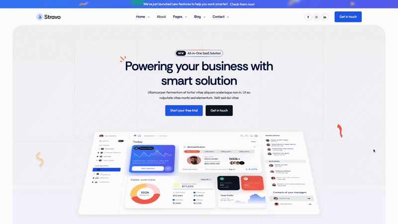
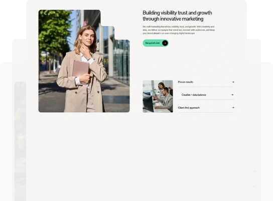
Stravo is built for SaaS companies that need to launch fast without sacrificing quality. With 20+ pages and 80+ pre-optimized sections, you can build a complete SaaS site in days instead of months. The design is clean and modern without chasing trends—it'll look current two years from now.
Stravo uses clean, minimal design that focuses attention on your product, not the template. The layouts emphasize clarity—visitors understand what you do within seconds. Feature sections are organized logically. Pricing is transparent and easy to compare.
The template includes smooth animations that feel professional without being distracting. Navigation is intuitive. Call-to-action buttons are prominent but not aggressive. Everything's designed to move visitors toward trial signup naturally.
Pick Stravo if you're a B2B SaaS company that needs flexibility and speed. The extensive section library means you can launch quickly now and add pages as you grow. Works especially well for startups that need to look established while staying agile enough to pivot messaging as they find product-market fit.
Price: $129 USD
Best for: Software companies, digital product teams, SaaS with complex features
Rating: ⭐⭐⭐⭐⭐ (5/5)
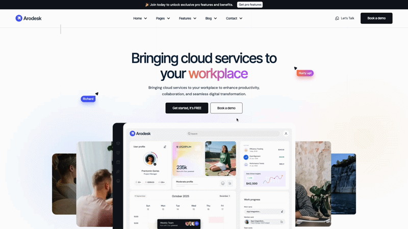
Arodesk is designed for software companies that need to explain sophisticated products clearly. If your SaaS has complex features, multiple use cases, or serves technical audiences, this template helps you communicate clearly without dumbing things down. It's built for companies where the product is genuinely complicated.
Arodesk balances professional polish with technical credibility. The design feels sophisticated but not stuffy. Layouts handle product screenshots and technical diagrams well—important when you need to show actual software interfaces.
The template excels at organizing complex information. Multiple feature pages let you explain capabilities in depth without creating walls of text. Use case sections help different buyer personas see themselves using your product.
Choose Arodesk if your software genuinely requires explanation and your buyers are technical or need to understand depth before committing. Works great for developer tools, enterprise platforms, or SaaS where the technical implementation is a key selling point. The template helps you look credible to technical audiences.
Price: $129 USD
Best for: Modern tech startups, developer tools, innovative SaaS
Rating: ⭐⭐⭐⭐½ (4.5/5)
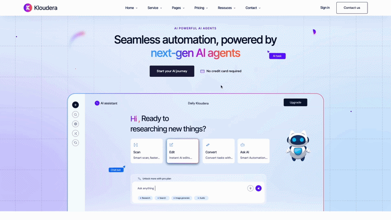
Kloudera stands out with its dark theme and modern aesthetic. If your SaaS is positioning as innovative, cutting-edge, or targeting developers who prefer dark interfaces, this template matches that positioning. The design feels contemporary and tech-forward without sacrificing conversion optimization.
Kloudera uses bold, confident design that makes a statement. The dark theme isn't just aesthetic—it helps product screenshots and demos stand out. Color accents draw attention to key conversion points without feeling aggressive.
The template handles product launches well. Pre-launch pages build anticipation. Launch day layouts emphasize trying the product. The design supports the excitement of a new product without over-promising.
Pick Kloudera if you're building something innovative and want your site to match that energy. Works especially well for developer tools, technical platforms, or SaaS launching into competitive markets where you need to stand out visually. The dark theme helps you look different in a sea of identical light-themed SaaS sites.
Custom website development takes 4-6 months minimum. That's a full quarter (or two) where you're either showing an unfinished site, using a landing page that doesn't explain your product, or trying to sell without a proper web presence.
Affordable webflow templates for startups let you launch in 1-2 weeks. Not a "coming soon" page—a complete site explaining your product, showcasing features, and converting signups. Start building your funnel this month, not next quarter.
Someone who builds SaaS sites designed these templates. They know where confused visitors drop off. How to structure pricing pages. Where to put social proof. What makes someone click "start trial" instead of bouncing.
You get years of SaaS marketing expertise baked into the layout. The feature presentations. The pricing structures. The CTA placements. All tested with actual software companies.
You're building software, not websites. Your engineering time is extremely valuable—every hour spent perfecting your marketing site is an hour not improving your actual product.
Templates let you check "professional website" off your list and get back to building features customers want. Update messaging as you learn. Add pages as you grow. Launch good enough now, iterate based on real user behavior.
Different SaaS products need different presentations.
Simple, focused tool: Stravo's clean design
Complex, technical product: Arodesk's depth
Innovative, modern platform: Kloudera's bold style
Don't try to force a simple template for a complex product, or vice versa.
Who's making the purchase decision?
Individual users (PLG): Simple, clear, fast trial signup
Technical buyers: Show depth, technical docs, API capabilities
Enterprise buyers: Emphasize security, compliance, support, case studies
Where are you in your journey?
Pre-launch: Focus on waitlist capture, product teasers
Early traction: Emphasize what you do, early customer wins
Scaling: Show breadth of use cases, enterprise features, social proof
Our complete SaaS template buyer's guide covers these considerations in more detail with additional template options.
Day 1-2: Brand basics (colors, fonts, logo)
Day 3-4: Write your value prop and main features clearly
Day 5: Add product screenshots and feature descriptions
Day 6: Set up pricing and trial/demo CTAs
Day 7: Test signup flows, launch
That's enough to start converting. Add customer testimonials as you get them. Expand feature pages based on what people ask about. Launch now, improve continuously.
Customize immediately:
Brand colors, logo, your actual value proposition, feature descriptions in plain English, pricing, trial/demo CTAs, product screenshots
Leave alone initially:
Template layout structure, conversion flow, CTA placement, section organization, mobile breakpoints
The template conversion architecture is proven. Don't redesign what's already optimized for signups.
Every SaaS site says they "help teams collaborate" or "streamline workflows." Nobody knows what that means. What does your software actually do? What specific problem does it solve? Say that on your homepage.
"Transform your workflow" = Meaningless
"Automated invoice processing that extracts data, checks for errors, and syncs with QuickBooks" = Clear
Making people click through three pages or "contact sales" to see pricing creates friction and distrust. If your pricing is transparent, show it. If it's complex, show starting prices or ranges. Don't make this a mystery.
Even enterprise SaaS can show starting prices or typical implementation costs. Transparency builds trust.
People land on your site ready to try your software. If they can't figure out how to start a trial in five seconds, they leave. Make your primary CTA obvious. "Start free trial" or "Get demo" should be visible on every page.
Don't bury signup under "Learn more" buttons that go to more marketing pages.
The single biggest factor in SaaS credibility? Showing your actual product. Real screenshots, real interfaces, real features. Template or custom, your site is only as good as your product documentation.
Generic mockups or placeholder images make people skeptical. Show what they're actually going to use.
Templates come with placeholder copy. Replace all of it with clear explanations written for someone who doesn't know your industry jargon.
"AI-powered workflow optimization platform" = Nobody knows what this is
"Software that automatically reviews invoices for errors before you pay them" = Everyone understands this
Nothing personalizes a template faster than real customer testimonials, logos, and case studies. Even one solid customer story makes your site feel legitimate and unique.
Templates provide structure. Your actual customers make it credible.
Before going live:
Let's be realistic. Templates aren't always the answer.
Skip templates if:
For 90% of SaaS companies and startups? Templates work great.
Your current website situation is costing you signups. Either you're showing an unfinished site, using a one-page landing page that doesn't explain your product properly, or you're "working on a redesign" while competitors with professional sites are converting the trials you should be getting.
Every week you wait is another week of missed opportunities. People are searching for solutions to problems your software solves right now. If your site doesn't look credible or explain your product clearly, they're trying your competitors instead.
Webflow templates for SaaS companies fix this immediately. Professional design, clear layouts, conversion-optimized structure. Everything you need to look established and start building your customer base.
Stop waiting for the perfect custom site. Launch good enough next week. Start getting signups this month. Iterate based on actual user behavior, not designer opinions.
The SaaS companies winning right now? They're not waiting for perfect websites. They're using templates that work and spending their time improving their product instead of obsessing over homepage hero sections.
For more detailed guidance on selecting the right SaaS template for your specific needs, including additional template options and selection criteria, read our comprehensive SaaS template buyer's guide for 2026.
Browse our complete collection of SaaS and startup templates. Pick one that matches your product, add your features and screenshots this weekend, and start converting trials next week.
Get unlimited access to 170+ templates →