%201.svg)


How we design templates that actually convert
Every template starts with a question: what does the visitor need to do on this page, and what is stopping them? We design around that answer — not around trends, not around what looks good in a portfolio, not around what other template sellers are shipping.
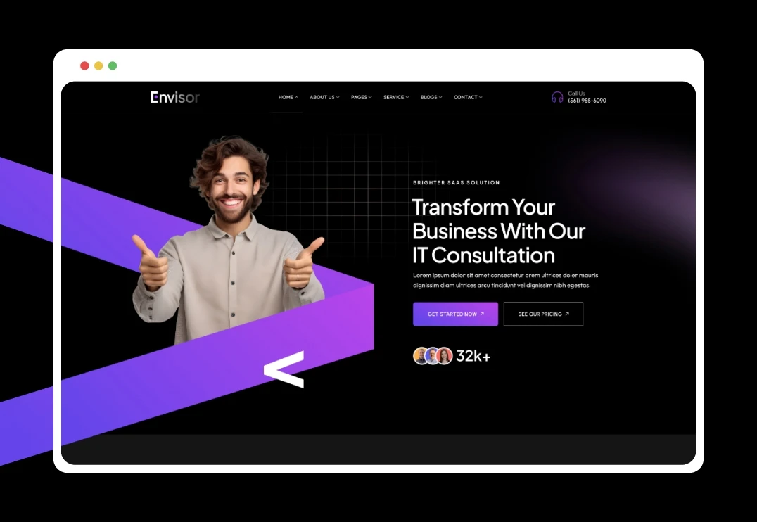
Our hero sections are built on a visual hierarchy principle: one clear headline, one supporting line, one CTA. No competing elements. No decorative clutter above the fold. When a visitor lands on a site built with our template, their eye moves exactly where it needs to — from value proposition to action — in under three seconds.
Every section below the fold follows the same logic. Feature blocks use consistent spacing and alignment so the eye flows naturally down the page. Testimonial sections are placed immediately after pricing — the exact moment when social proof reduces purchase anxiety. CTAs repeat at calculated intervals, never more than two scroll lengths apart, so the visitor always has a clear next step regardless of where they are on the page.
This is not decoration. It is conversion architecture.
Design principles behind every template
Whitespace is intentional, not empty. Our layouts use generous spacing between sections because dense pages overwhelm visitors and increase bounce rates. Every gap between elements exists because it makes the content above and below it easier to read and act on.
Typography drives hierarchy. We pair typefaces for contrast — a bold display font for headlines that stops the scroll, a clean sans-serif for body text that keeps people reading. Font sizes step down in a consistent ratio so the visual hierarchy is unmistakable even at a glance.
Color is functional. Primary brand colors are used exclusively for CTAs and interactive elements. When the only colored element on the page is the “Get Started” button, that button gets clicked. Background colors shift between sections to create visual separation without borders or dividers.
Interactions serve a purpose. We add scroll animations and hover effects only where they reinforce the user’s understanding of the page structure. A section that fades in as you scroll signals new content. A card that lifts on hover confirms it is clickable. We never animate purely for visual flair — every motion has a job.
Mobile is not an afterthought. We design from mobile up across three breakpoints. Navigation collapses cleanly. Images resize without cropping. Text remains readable. Forms are thumb-friendly. Over 60% of web traffic is mobile — our templates treat it that way
Built for the way Webflow actually works
We are an official Webflow Premium Partner and we build exclusively in Webflow. That matters because our templates use Webflow’s native features the way they were designed to be used — not hacked together with workarounds.
CMS collections are structured logically with clear field naming, so adding blog posts, case studies, or portfolio items takes minutes. Classes follow a consistent naming convention, making global changes straightforward. Components are built as reusable symbols, so editing a footer or navigation updates it across every page.
We include Figma source files with every template. Plan your design changes visually before you open the Webflow designer — test typography pairings, map content structure, and finalize your color palette in Figma, then execute in Webflow with confidence.
What sets our templates apart
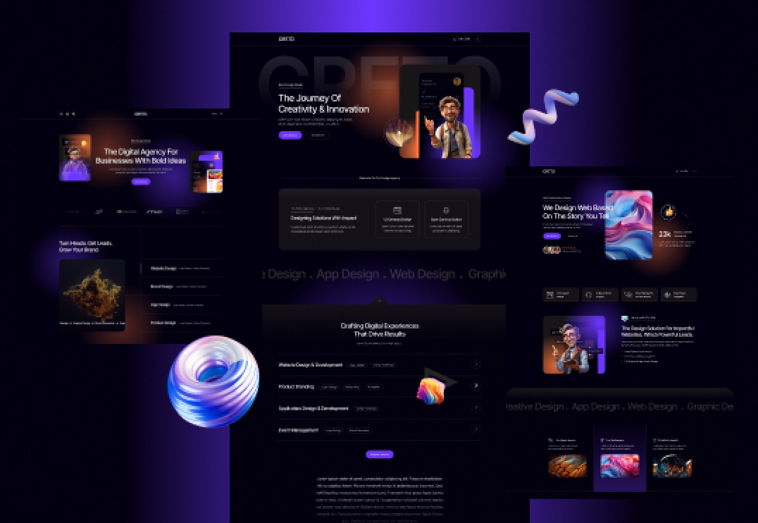
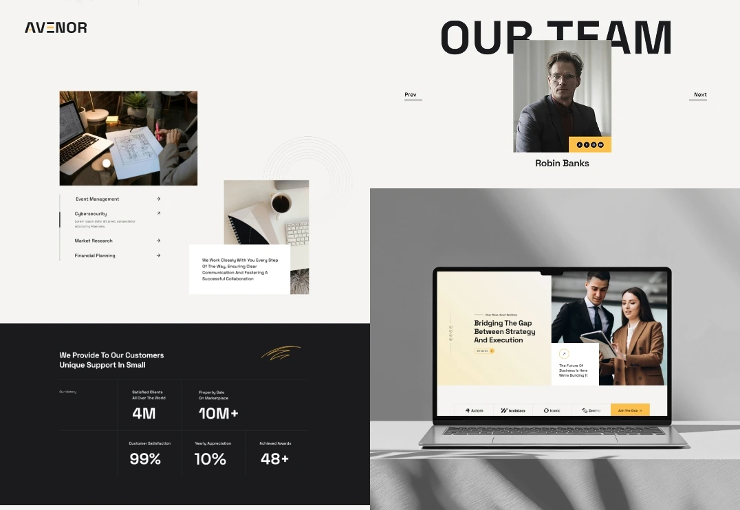
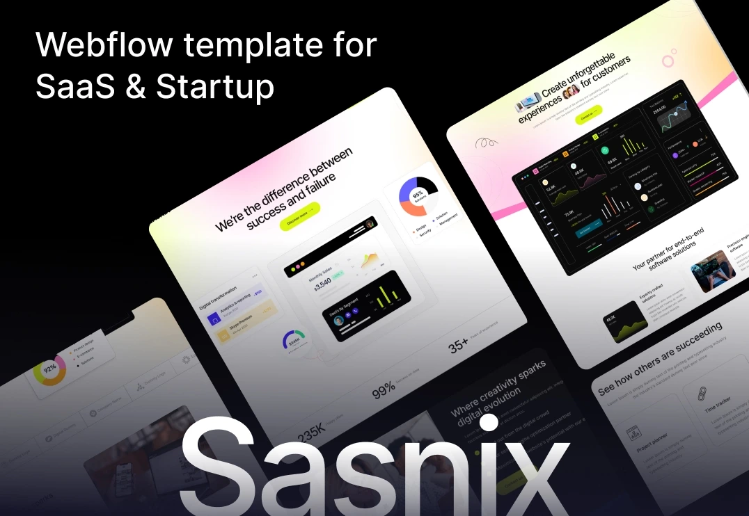
Industry-specific structure. A SaaS template includes pricing comparison tables and product screenshot sections. A consulting template includes case study CMS and credential displays. A restaurant template includes menu layouts and reservation forms. Every category template is structurally designed for its specific use case.
Conversion-tested layouts. Section order, CTA placement, and content flow follow established conversion patterns. Hero sections lead with clarity. Social proof follows feature explanations. Pricing appears after value is established. Contact forms sit where intent is highest.
Clean, scalable code. Our class naming is systematic, our interactions are lightweight, and our CMS structure is documented. When your site grows from five pages to fifty, the template architecture holds up.
Ongoing releases. We add 4–5 new templates every month. Buying once — or subscribing — gives you access to an expanding library covering new industries and Webflow features as they ship.